GBS Custom Template
GBS, a blockchain solution provider, needed multiple landing pages to market their services.
Company Name
Global Blockchain Solutions
Industry
Blockchain, Finance
Project Scope
Design & Development
My Role
UI Designer & Front-end Developer
Problem Statement
GBS needed multiple high-quality landing pages designed & built within a limited budget.
Challenge
Considering client’s limited budget, it was very hard to design pages without sacrificing the quality of the content, graphics, etc.
Solution
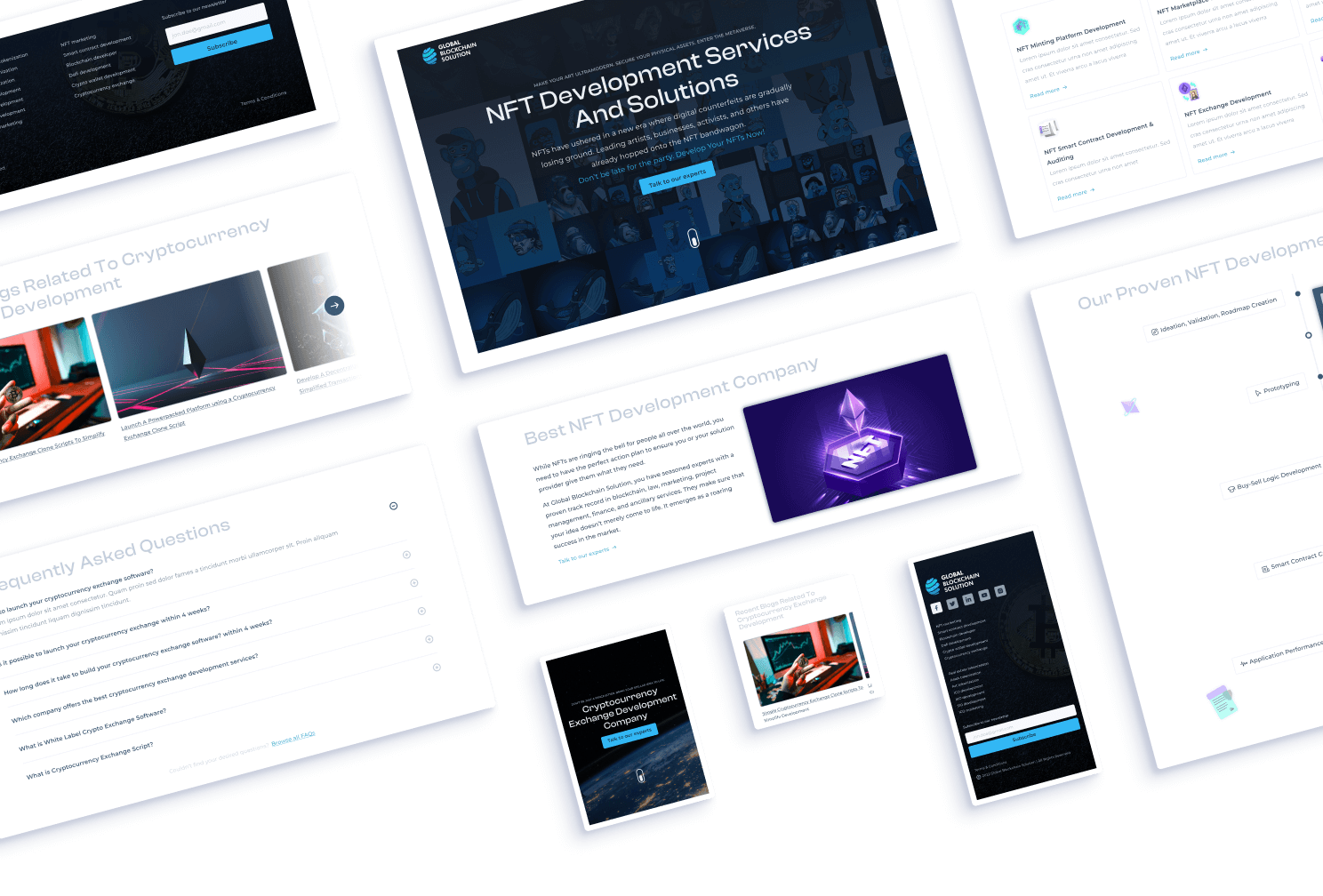
While skimming through the content, I noticed a similar pattern used throughout the content of all their services.
A hero section with a heading, brief description, a CTA, subheadings with their descriptions, FAQs, etc. These were some of the similarities I found in the provided content.
So, instead of designing & developing a new landing page for each of their service, I suggested creating a template which would follow the same pattern used in the content.
This not only saved us time but also helped us work within the client's budget.
It was a win-win situation for everyone!
Design Process
Before jumping into Figma and starting the design process, I prefer to conduct some preliminary research to gain insights about the project and its design requirements.
Keywords (considering the client’s brand) -
- Professional
- Minimalistic
- Simple
- Clean
Looking for design inspiration -
I searched popular template builder sites like Themeforest, Template Monster, & Creative Market for landing page design inspiration to understand what makes a great template.
I noticed that these websites had multiple layout variations for each section of their templates. For example, the hero section had both a centered content layout and a left-aligned content layout.
I found the insight helpful for handling edge cases, but to save time and ensure consistency, I discussed with the client and decided to create variations for the hero section only.
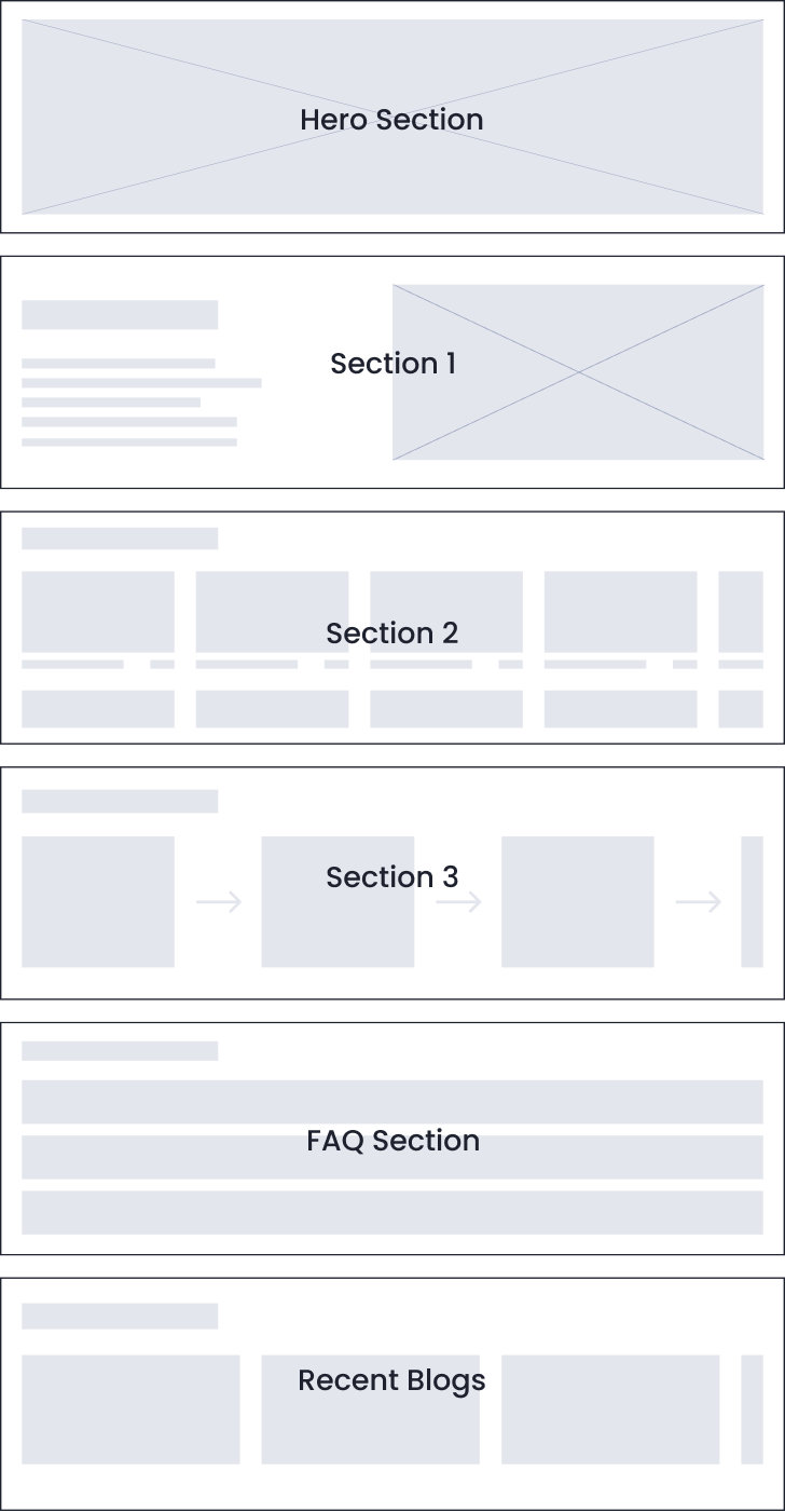
Wireframing
I identified sections that required multiple layout variations and designed them directly without a wireframe.
My goal was to keep the design simple and familiar, using basic layouts that people are accustomed to seeing. I only used the wireframe phase for structuring the sections.
Visual Design
And then I finally started doing my favorite part of the process - VISUAL DESIGN
I hopped onto Figma and started with a 12-column grid setup & a Desktop-first approach.
I chose the color Blue for GBS' design because it symbolizes peace and wisdom, aligns with professional tech brands like LinkedIn and Facebook, and is also present in GBS' logo.
I don’t necessarily start creating color palettes to be used in the design right away.
It’s time to choose a typeface now
I use two typefaces in this template - a display typeface for headings to convey professionalism, and a clean sans-serif typeface for body text that is legible even in small font sizes.
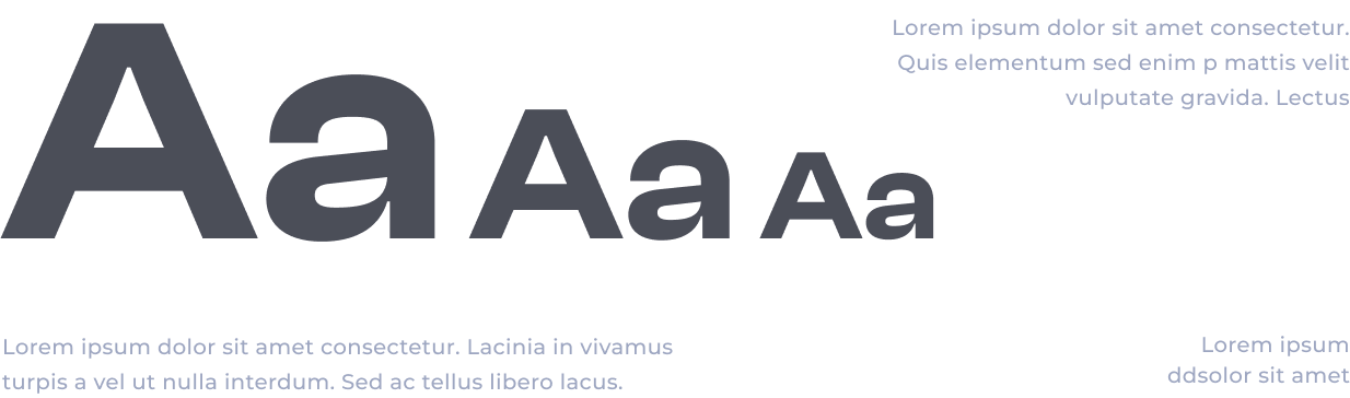
I chose Clash Display for headings and Montserrat for body text after comparing fonts.
Clash Display’s wide glyphs convey premium quality, while Montserrat's wider glyphs complement it perfectly. A perfect pair 🙌.
Layout Design -
After finalizing the colors and typefaces, I moved on to the layout part of visual design. I used common types of layouts for each section of the template design, because Jacob’s Law .
Multiple layout variations
It is important to mention that I was also creating a design system on the side to make it easier for further changes that might happen in the future
Design system
for the template
My design system includes a typography system, color palettes, spacing system, buttons, and other components that may need to be changed, such as the navbar and carousel.
Development -
For the development of the template, I used HTML, CSS, & JS.
I prefer starting with mobile design and then move on to desktop. While coding, I make sure to address potential issues such as long headings, lengthy body texts, and text visibility.
Outcome -
Finally, after some design -> feedback -> iterating over & over, I completed the final version of the template design.
Deliverables -
- Figma document
- All coding files (HTML, CSS, JS)
- Images (.webp) / Icons (.svg)
- Font files (.ttf)
Lessons learned -
Communicating effectively with the client made this project a success
Skipping wireframing phase worked out for me. You don't always have to do every step of the process, it can save time & effort.