Geodaka Homepage Redesign
Geodaka, a digital real estate service provider, required a modern redesign of their homepage.
Geodaka
Global Blockchain Solutions
Industry
Digital Real Estate, Proptech
Project Scope
Redesign & Development
My Role
UI Designer & Front-end Developer
Problem Statement
Geodaka needed a modern look for their website’s homepage because it was outdated.
Challenge
Because of the project's limited scope, I was unable to conduct research or assess the redesign's impact on sales. As a result, I relied solely on design principles.
Solution
Using UI/UX principles, typography, color, and minimalism can give your page a modern look and make it easy to use for visitors.
Design Process
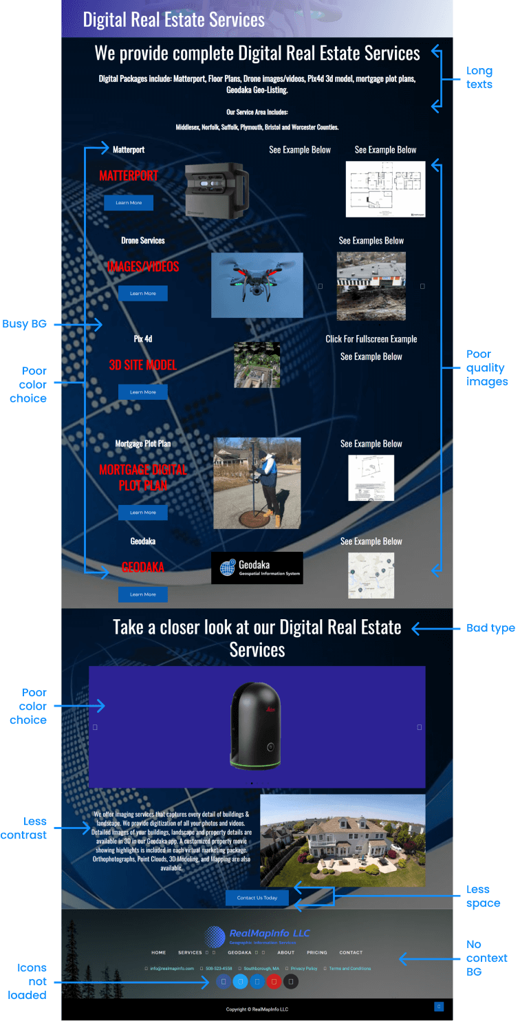
Before I start redesigning something, I find out what's not working in the design. That helps me decide if the whole design process is necessary or just some parts of it.
After analyzing their old design, I identified some major issues. Since they had little content, I skipped the discovery phase in which I do some research such as looking for inspiration.
Keywords (considering the client’s brand) -
While talking to the client, they mentioned that they don’t want the page to feel overwhelming.
- Luxury / Professional
- Simple
- Clean
So, I came up with these keyword to work with -
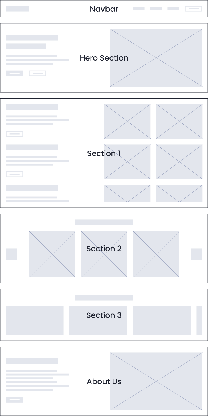
Wireframing
Although I could've skipped wireframing, the client informed me of upcoming content updates. So, I proceeded to wireframe after getting that content.
The client gave the thumbs up on the wireframe as it fit their content perfectly. The focus here was on the structure of the page, not the design.
Visual Design
And then I finally started doing my favorite part of the process - VISUAL DESIGN
I hopped onto Figma and started with a Desktop-first approach & a 12-column grid setup.
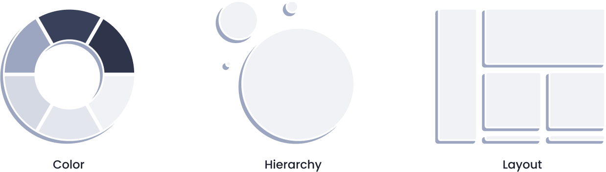
Since I wanted to make the redesign simple & minimalistic, I chose to go with the safest bet for colors and typography.
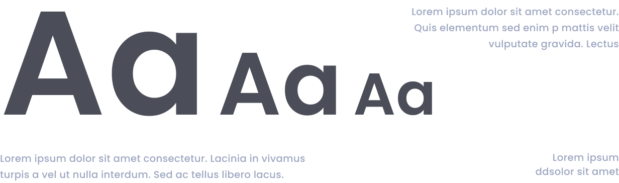
I decided to go with a Bluish Purple color, since it symbolizes wisdom & luxury. For typography, I went with the typeface Poppins which is a typeface that you can’t go wrong with.
Whenever I feel like I don’t have enough time to research which colors & typefaces to choose, I mostly try to go with the above choices
Layout Design -
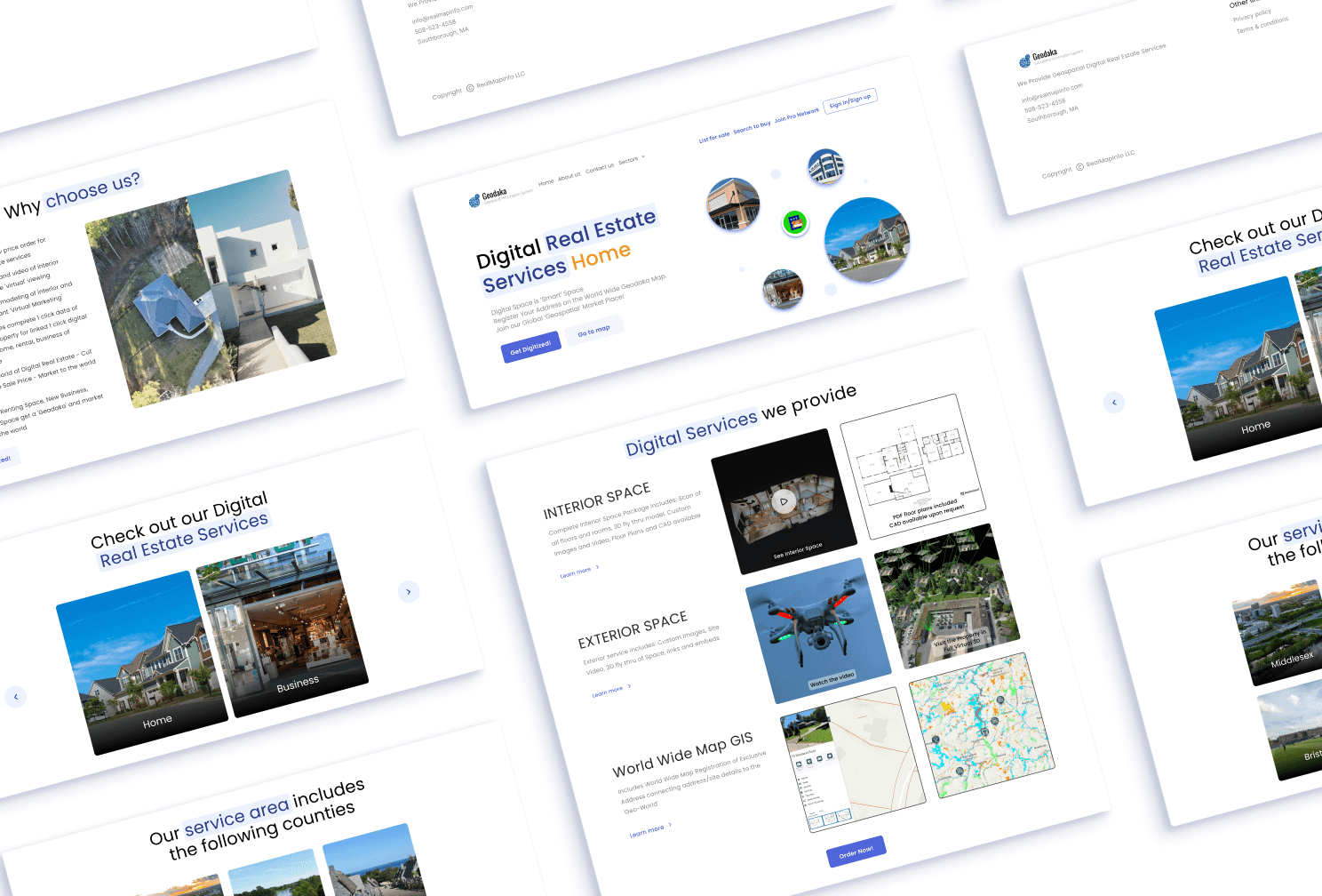
After a couple of experimenting with the layout, colors, & grids, the 1st version of the redesign was ready to show and get some feedback.
First Iteration of
The Redesign
After that, we had some content changes such as changing the copywriting, removing some images, order of the layout, etc.
And then after the 5th iteration, we got our final redesign of the page with which we all were satisfied with.
Development -
For the development of the template, I used HTML, CSS, & JS.
I prefer starting with mobile design and then move on to desktop. While coding, I make sure to address potential issues such as long headings, lengthy body texts, and text visibility.
Outcome -
While it took 5 iterations to complete the redesign, the project was completed successfully with a smile on everyone’s face.
Deliverables -
- Figma document
- All coding files (HTML, CSS, JS)
- Images (.webp) / Icons (.svg)
- Font files (.ttf)
Lessons learned -
Going with the safest choices for design elements can help you save the time & efforts while still making the project a success.